 On these charts, materials of each class (e.g. metals, polymers) form 'clusters' or 'bubbles' that are marked by the shaded regions.
We can see immediately that:
On these charts, materials of each class (e.g. metals, polymers) form 'clusters' or 'bubbles' that are marked by the shaded regions.
We can see immediately that:
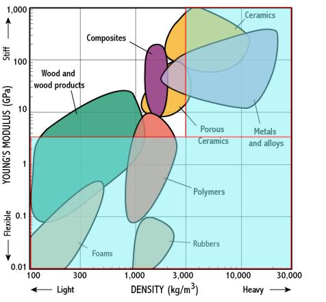
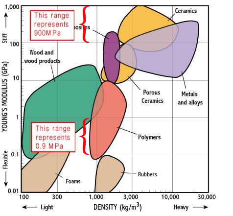
Here is a materials selection chart for 2 common properties: Young's
modulus (which describes how stiff a material is) and density.
On these charts, materials of each class (e.g. metals, polymers) form 'clusters' or 'bubbles' that are marked by the shaded regions.
We can see immediately that:
Where selection charts are really useful is in showing the trade-off between 2 properties, because the charts plot combinations of properties. For instance if we want a light and stiff material we need to choose materials near the top left corner of the chart - so composites look good.
Note that the chart has logarithmic scales - each division is a multiple of 10; material properties often cover such huge ranges that log scales are essential.
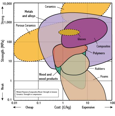
There are a selection charts for many combinations of material properties, e.g. 'strength - toughness' and 'electrical resitivity - cost'. The next section shows how we can take selection charts further...
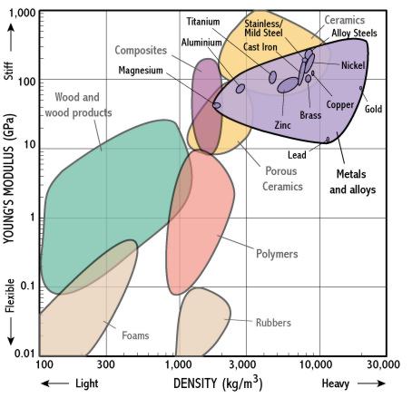
 On these charts, materials of each class (e.g. metals, polymers) form 'clusters' or 'bubbles' that are marked by the shaded regions.
We can see immediately that:
On these charts, materials of each class (e.g. metals, polymers) form 'clusters' or 'bubbles' that are marked by the shaded regions.
We can see immediately that: